Responsive web design revisited
A good few months have passed since I wrote a post with an introduction to RWD. This is somehow good because now I know more about this than I knew back then, and it proves that this time was well spended. I do not know tho, whether it makes sense now to convince anyone that RWD is the future. RWD is here and we are left with nothing but to accept it. However, if somehow you do not know yet what RWD is and you wish to read this post with understanding, here is a brief and hopefully helpfull entry on the subject. See you in a bit :-)
Done? Let’s hope so:-)
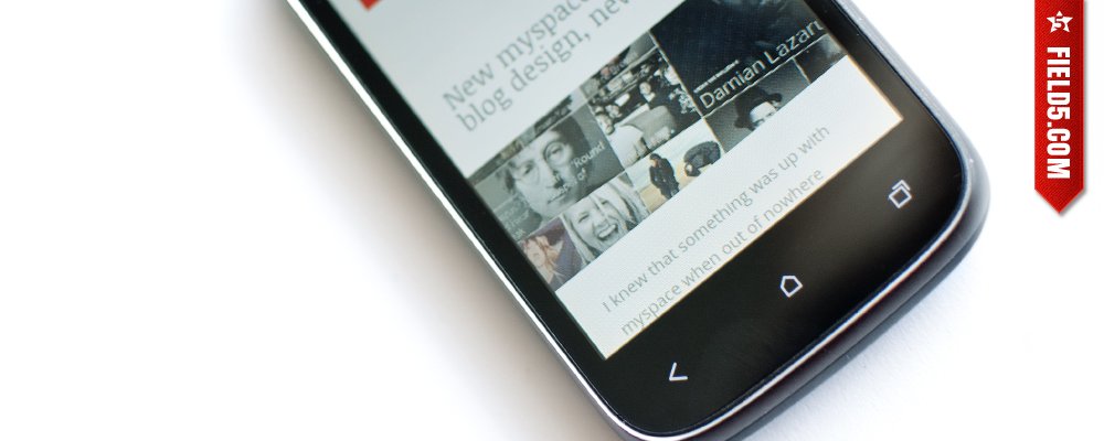
Responsive web page detects the device resolution and appropriately reacts to it, adapting its system to the appropriate size. It often happens also that the mobile version will have some information in a condensed form, while the wide-angle screens version can have additional column. You can see basic concept of how RWD works by opening this link in a new window and then grab the bottom right corner of your browsers window and change window size in your own pace. I will not take responsibility for dislocated wrists and broken fingers ;)
All great… but…
It’s not an easiest task to design responsive web site. First of all, because you have a lot to plan, keeping in mind the smallest detail. A good practice here is to start with the mobile version of this project and than progress to the next breakpoint. Basic web site should have 2-3 breakpoints, which means that it should have at least 3-4 versions. The optimal scenario is to use following breakpoints
- mobile < 768px
- Ipad portrait 768px
- Ipad landscape/notebook 1024px
- 3/4 screen 1280px
- wide screen 1440px and up
As you can imagine, responsive web design is definately more time consuming than the regular web design, unless… we can get rid of all the graphics, then it should go pretty smoothly, sound familiar? :-)
As famous people massively indulge themselves under the knife of plastic surgeons. Sucking fat out of the buttocks just to pump it back in other areas.
Websites massively have gone under the designers knife, and the cutting began. The first one out were graphical buttons, right after ornaments, textures, and finally gradients. The latter happily took ,under his rainbow wings, sir Johny Ive, and that’s how iOS7 happen.
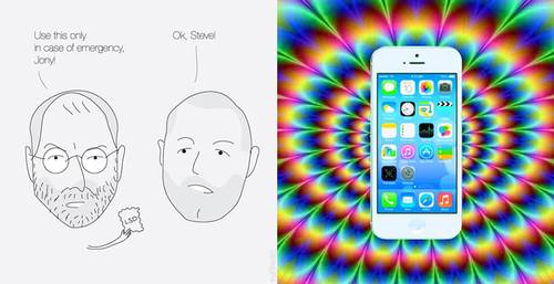
The difference between celebrities and websites is that after these procedures, the website, unlike the vast majority of celebrities look much better.
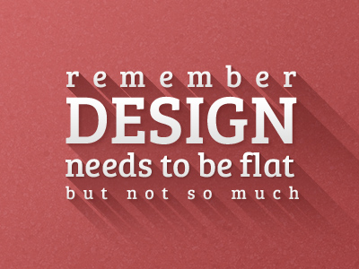
I think that the popularity of the metro style and flat design, especially in responsive web design is due to the fact that it is simply easier. It is easier to control the background if it has one, uniform color. I dare say that what is now sold as a fashionable minimalism is simply the most practical and least time-consuming approach to the developing pages and responsive systems. But do not despair, fortune is fickle, bells and whistles of the flat design is yet to come. Ask Johnny :-) Or google “long shadow”. You can even buy a neet long shadow maker, which creates long shadow in eight directions on graphicriver.
But what was I … aha!
After the fat camp websites lost their heavy graphics and textures, and font, color, photography and … margins is what’s left of once big fat websites. Welcome to the world of flatsponsive. Where are all the websites look as one, because if you have only four components, the number of possible combinations is limited. Isn’t it?
Flat design with rwd is popular because, in addition to being a nice change from the existing graphical richness, is the simplest and most logical of all possible ways. Simpler technologicaly speaking, but from the designer point of view, not so much. Paradoxically, the less tools at the disposal the more difficult is to design something that really stands out. This is the time when you can see true designers craft. It is no longer possible to hide deficiencies by mixing them in photoshop. Creating textures, beveled buttons, and crazy ornaments. I know what I’m talking about, I’ve been there and done that:-)
Responsive design is also a wealth of new choices about what and in what form to show on specific device. We left outside of rigid framework of lowest minimum resolution, and we got smacked in the face by freedom. Because that’s how we can control the layout, as for how the text will break, we have nothing to say.
The user first
I can just dwell endlessly point out the advantages and disadvantages, show differences, count the pros and cons. The real winner of RWD is the user. Finally! We will be able to use the network where we want and how we want to, because there is nothing more annoying as trying to view standard page on a mobile phone when the train is leaving and a phone number to helpdesk is given in flash.
In conclusion
No matter what fashion we are caught in a given season, whether it is a flat design, the root of minimalism or rich graphics. I do not think we’ll ever return to the worn out saying: the smallest popular resolution. Not with the amount of devices that already have access to the internet, and more are on the way. Now we can observe how RWD is transforming from innovation into the standard.