What is Responsive Web Design
If for the past few days, weeks, months, you constantly hear term Responsive Web Design or RWD and you kinda know what it is but not really. This article is for you :-) Those more familiar with this topic I encourage to check my blog a bit later as I will write more about RWD in few days.
A short explanation
In a few words responsive web design it is a specific way of designing websites. What is so special about it and is it worth all that fuss? I will explain in a few seconds. Keep reading:-) Term Responsive Web Design appears for the first time in the Ethan Marcotte’s article for alistapart.com
Not so long time ago most of the websites were designed with desktop and laptop computers in mind.
In some cases the website had it’s mobile version for mobile users. Which had, for most of the time, les graphic and content than the full version of the website. But the world is constantly changing and now it’s not the case anymore.
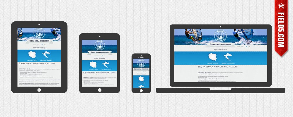
Multiple devices one website
Today, the spectrum of devices on which you can browse the web is huge. Starting from mobile through smartphones, tablets, laptops, finishing at desktop computers with 4:3 or widescreen monitors. There is no way to design different website for each of these devices.
And this is the time when RWD saves the day. It means that responsive designed website will be looking great on each device. And not thanks to a stroke of luck but thanks to total control of the project by it’s designer.
Who needs it?
What use is from great design, smoking graphic and fun animation if it cannot be appreciated by number of people? Sure thing if it’s just a presentation website, and reaching out to everyone is not on top of the list. But if it’s a business website, where fair amount of people might be using smartphones, this might be a serious problem fairly quick.
If you have your own website you are probably thinking right now: This is not affecting me at all, my viewers use only desktop computers or laptops. And you are probably right, but are you sure it would not change rapidly in next two years? Do you have that time and money to redesign your website each year or two? Or every time when a new super popular device hits the market? Think about it :-)
Why is this blog not responssive?
Well… Good question:-) It would be if I had the time, but I’m a freelancer and when the job knocks to your door, you take it, not thinking if you will have the time for redesigning the blog. But it’s only partially true. The second reason is that still the percentage of my viewers using other than desktop devices is less than 1.5 %. Why it’s important? I will explain in the next article. That’s right! I’m making sure you will come back;-) In the mean time leave you thoughts in the comments.
Update* This blog is finaly in RWD