7 + 1 tips to increase User Experience on mobile devices

The reality where people use their mobile devices to browse the internet as much as they use their desktops, is no longer the future. It’s our present. This is why user experience and ease of use of our website should be as good on mobile devices as on desktops. Here are a few tips.
0. Speed up your website
Slooooooooow websites are bad. Many studies have confirmed that users abandon websites if they take too long to load. I do that too. That’s why fast websites are crucial for UX, especially in mobile context where internet connection speed is often limited. We’ve prepared separate article for those who want to speed up their website.
1. Make sure your site is responsive
In short, thanks to responsive design our website looks good on every device. Website adapts to the screen size, which makes it easier to read. And how it looks exactly and what’s the difference?
At the ami.responsivedesign.is you can enter any web address and simulate how webpage looks on different devices. Let’s see first what it looks like when there is no responsiveness.
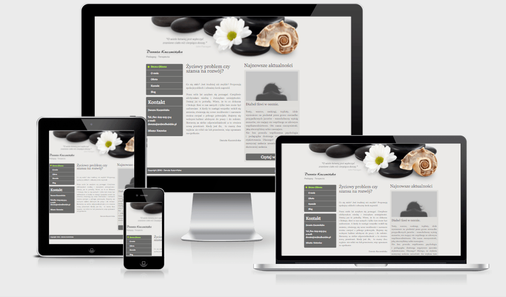
While on laptop and big screen website looks ok, on tablet and phone you can see that text is cut off on the sides. It simply doesn’t fit. You need to move left-right to see the content of this website. Some devices will show non-responsive websites zoomed out so that all content would fit in available space. You then have to zoom in to be able to read anything because the font size is so small. And how it looks when website is responsive?
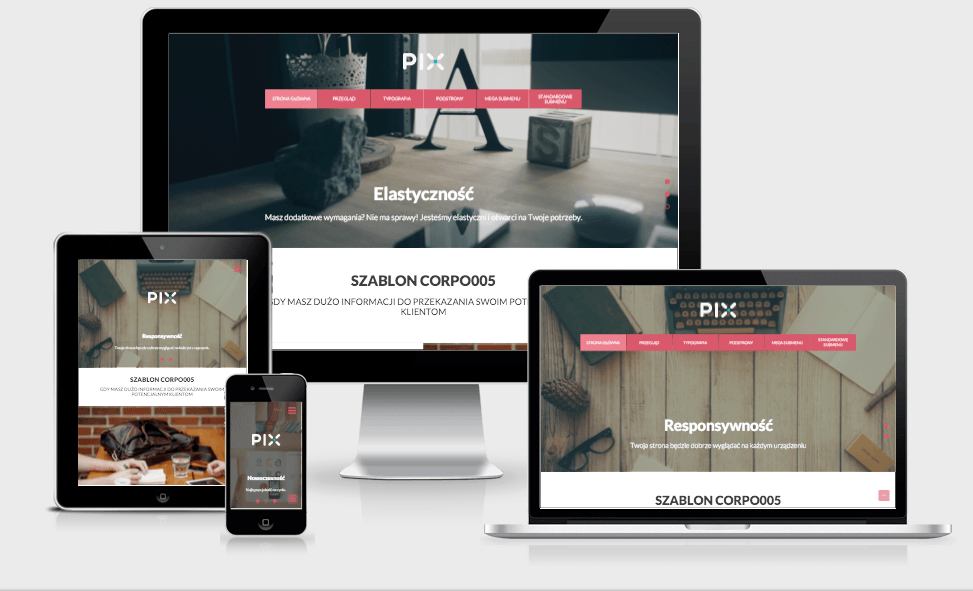
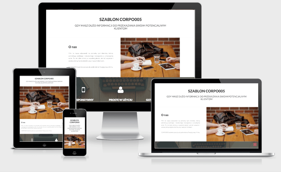
Let’s take as an example our template CORPO005. You can see that the webpage adapts to the screen size. For example, menu that normally wouldn’t fit on the mobile phone is hidden and available under the menu icon. Text in two columns is changed into one-column layout. Those little changes make websites easier to browse by mobile users.
2. Your finger is larger than mouse cursor – increase the spacing and buttons
Most mobile devices have touch screen. Which means that we use our finger to move around the page, “clicking” on the links and other buttons. Smaller screen doesn’t mean that everything should be smaller because we have less space available. On the contrary, some page elements should be larger so that they are easy to “click” without the risk that you hit something else by accident.
Let’s consider a subpage list in menu. When the spacing between items is too small, there’s a chance that we will tap two links at the same time. We then can be redirected to the subpage we didn’t want to go. Our fingers have a much larger space that will be activated when you tap on the screen than a mouse. I’ve highlighted below with yellow “clickable” area, and size of your finger with pink (or salmon if you prefer).
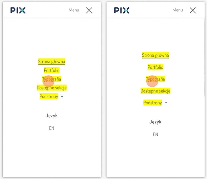
You can see, that when you increase spacing between items, there is little chance to click few elements at the same time. It’s very frustrating when website/mobile app is doing something we didn’t want to do, just because buttons are too small and/or too close to each other.
3. Put important informations at the top
Mobile users usually visit our website in a hurry when they need some information. They want to call us or find out how to reach us. So for example:
- phone number
- opening hours
- during holidays/days off additional and clear information on what hours we are open
- driving directions
are informations that users usually are looking for from mobile and should be available as soon as possible. Preferably at the top of a page.
4. Link the phone number
Mobile systems are trying to be intelligent. They analyze the content of the page and link string of digits if they think it might be a phone number. They are often right. But not every mobile have this option, and some will link something that is not a phone number (like a tax number or postal code). So make it easier for your potential customers and make your phone number clickable with tel:. Like that:
<a href=”tel:+48669668667″>669 – 668 – 667</a>
It’s a lot easier when you can call with only one tap instead of trying to copy and paste the number. Just remember to add country prefix at the beginning and remove all spaces and dashes. You can even change the title of that link to something more friendly like “Call us now”.
5. Add link to driving directions
As previously mentioned, one of the essential informations for mobile users are directions. Embedding a map is great idea, but we can do something more. Many users have Google Maps app on their phone. If you add a link to Google Maps with your location already set as a destination, on most phones user will have a choice to open it in the app. The only thing they will have to do now is set their starting point and start navigation. How to do it exactly? Read our step by step tutorial “How to add a link to Google Maps with directions“.
Size of the website is important on mobile devices as sometimes users use their mobile network to access the internet. So using a link to directions instead of full embedded map (that loads all the images and stuff) is better idea, as it will save some transfer for those who don’t currently need directions.
6. Use appropriate field types in the form
On the mobile devices keyboard looks a bit different than on our desktops. If we have for example a contact form, you can somewhat control what keyboard will be shown to user by default. Filling forms on mobile isn’t that comfortable, so showing adjusted keyboard based on field makes it a bit easier to complete. Therefore, you should choose field type to the values you want to get from the user. For example, the standard keyboard layout for the text field looks like this:
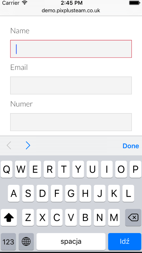
There is nothing special here. Regular letters and option to switch to numbers. What happens if we change field type to “email”?
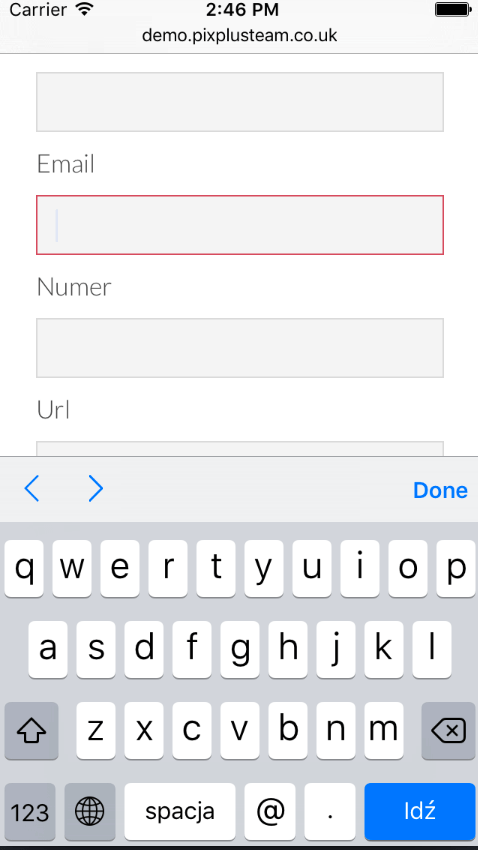
It looks as if nothing has changed, but when you set field type to email, there are two additional buttons visible at the first screen: @ and dot. You might think it’s nothing, but those are special characters that we always use when we are entering an email address. Pulling them to the first screen speeds up the process as you don’t have to switch between layouts to add them.
If you want to know how keyboard adapts for other field types, read “Field types in forms and the phone keyboard“.
7. Hide flying and sticky elements
We have to remember that screens on mobile devices are rather small. Leaving sticky menu bar at the top is a good idea (as long as it’s not too high). But is it really necessary to keep all social links and some extra dialogs stick on scroll? Are those elements crucial for user all the time?
We can often see some boxes on the side(s) of screen like “rate us”, “follow us”, “we have certificate”, “we use cookies”. And when you hover over whole bunch of informations shows up. It doesn’t have to be sticky on mobile. It takes space and makes it difficult to navigate the site.
It is best to make such elements static or even hide it on mobile devices.
Summary
Mobile devices are part of us now. The only difference compared to desktops is how and when we use them. It’s usually when we are in a hurry. Quick access to important informations and ease of use are those things that positively affect the company’s image. Those few tips I presented here are not a rocket science and you don’t need some advanced knowledge to use them. Think about your users, your potential customers and take care about their comfort on mobile devices.
Cover photo by Oliur Rahman on Unsplash